


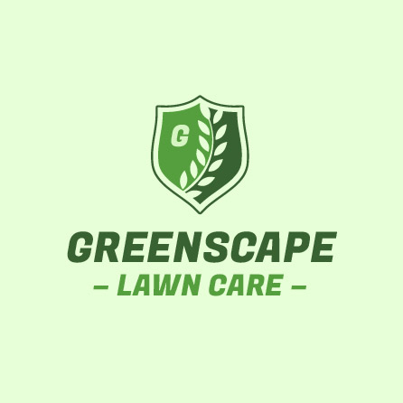
Examples created using our free logo creator


How to create a logo for your business or event

Enter your company name, and choose your industry.
Enter your information and let our cutting-edge AI technology create professional logo designs for you to browse.

Choose from 1000’s of logo designs.
Browse 1000’s of personalized and AI generated logo designs online. Use filters and explore diverse logo ideas until you discover the ideal logo to fine-tune.
Customize colors, fonts, layout, and more!
Save your logo design as is or make edits using our online logo maker tool until it’s the perfect logo design for your business or event.
The #1 logo design tool to start your brand
Over 40 million businesses have relied on our logo maker to craft their unique brand.
Use your logo at no cost on any of LogoMaker’s business cards, promotional items or website packages.
Create, edit and save your own professional logo design in minutes with our online logo generator.
Download your logo design in an array of sizes and formats with one of our logo packages.
Start designing your logo for free
Build a brand and grow your business using your logo design

What are the advantages of designing a professional logo using a online logo maker?
Quick and Efficient - generate a logo design in 5 minutes
We've harnessed the power of AI to remove all uncertainty from the logo design process, empowering you to become a logo designer. Utilize our AI-driven platform to generate a creative and professionally crafted logo tailored to fit your business or event.
Feel like a logo designer and customize your design from our logo library
LogoMaker has a significant selection of logo designs, featuring an integrated AI logo creator and a user-friendly online editor—all at no cost. Our free online logo creator is easy and you can download your logo package within minutes.
Outstanding Customer Service
Our goal is to excel as the premier online free logo maker. We highly value our customers' feedback and remain dedicated to promptly resolving any issues or concerns they may have.
LogoMaker is the leading online logo maker
LogoMaker has been showcased in prestigious publications such as The Wall Street Journal, Inc magazine, and industry-specific journals like Communication Arts. As industry frontrunners, we’re dedicated to supporting you with your logo ideas and beyond!
Begin designing your logo now
Where can I use my custom logo design?
Logo Design
Transform your logo idea into reality
Everything originates from an initial logo idea, yet it has the potential to evolve into something remarkable. Our AI business logo creator is designed to guide you in turning a concept into reality. Create and tailor your logo design to reflect your identity, brand or occasion. Once you’ve created your new logo, use your new logo design on business cards, apparel, new website, or purchase a logo package.
Browse Logo DesignsPromotional Products
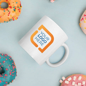
Foster brand recognition with LogoMaker products
Logo Maker's personalized promotional items are instrumental in brand building and encouraging customer retention. Express gratitude to your top clients by presenting them with a custom mug featuring your personalized logo design alongside their invoice as a token of appreciation. Market your business on the go with a customized car magnet on your vehicle,. Create a logo design to congratulate someone on their engagement and get a personalized yard sign to share with the neighborhood. All of LogoMaker's promotional products offer a budget-friendly and uncomplicated approach to expanding brand recognition and showcasing events for all occasions.
Browse Promotional Products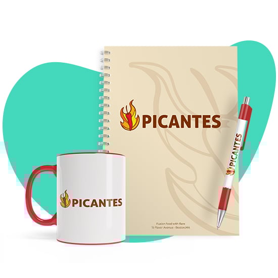
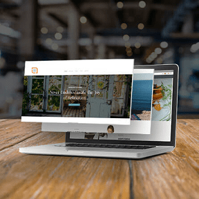
Website & Marketing Solutions
Straightforward strategies for expanding your online business
Establishing your online presence plays a pivotal role in business growth and brand development. Logo Maker aims to simplify this intricate process by offering affordable solutions to get your business online. Our simplistic online presence builder, a top-tier template website editor, allows you to create and manage a mobile-responsive website across various domains.
Our team at Logo Maker has partnerships that aim to empower you in engaging customers and develop an online footprint. From Google Workspace (inclusive of Gmail, Meet, Docs, and more) to tools for managing all your business listings (such as Apple & Google Maps, Yelp, Facebook, etc.), each of these online solutions is selected for their simplicity, cost-effectiveness, and ability to allow your business to appear when users are searching for your services or products.
Browse Website Products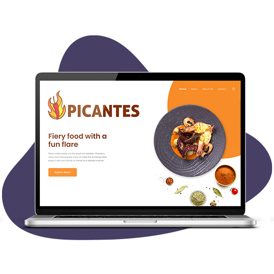
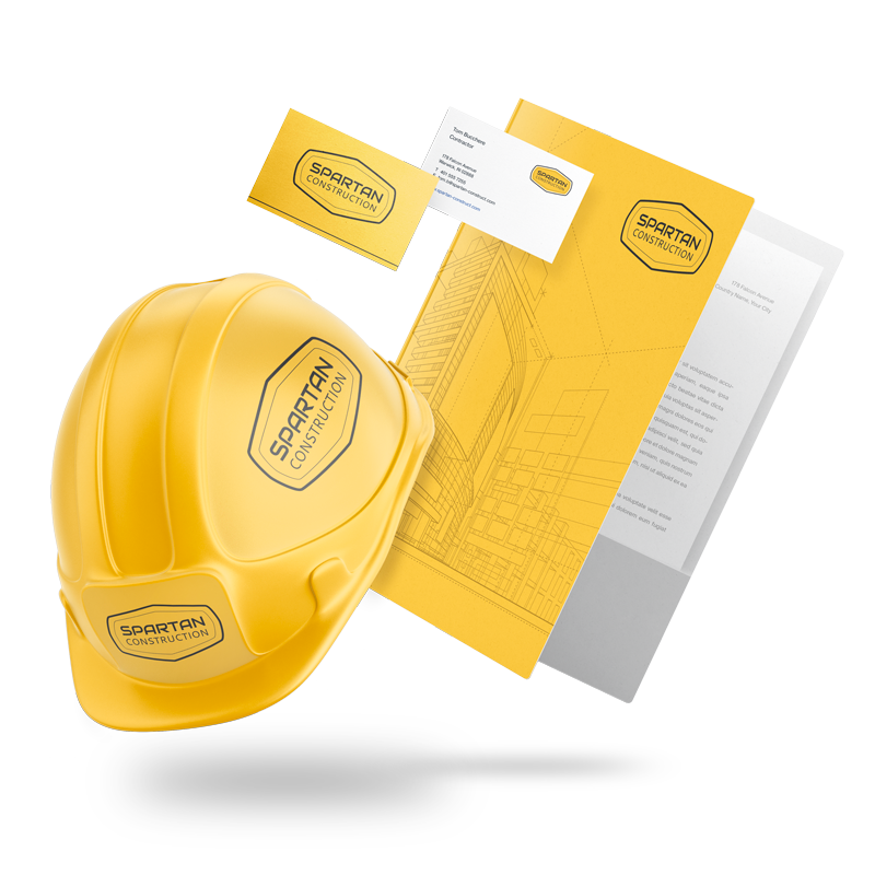
Business Cards
Expand your network with personalized business cards
Design impressive business cards using LogoMaker’s robust business card editor. Elevate the uniqueness of your business cards by adopting a fresh design or by uploading your own visuals. Choose from a large selection of business card templates suitable for your brand and industry. Logo Maker provides customized business cards in diverse finishes and sizes, catering to various business sectors, be it in construction or the beauty industry.
Browse Business Cards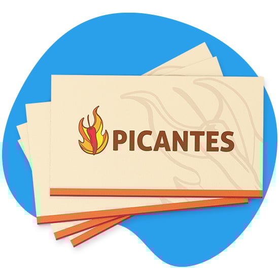
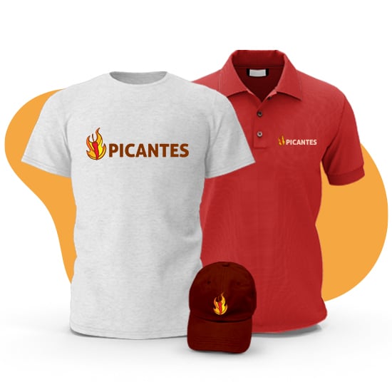
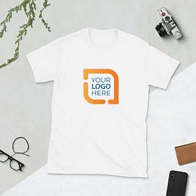
Apparel & Uniforms
Branded attire, promotional items, or merchandise
Logo Maker presents a convenient and budget-friendly method to expand your brand with custom-branded apparel. Our range includes an array of options, spanning from personalized t-shirts and embroidered polos to hats, masks, and button-down shirts. Choose the perfect item for your company and utilize our user-friendly apparel editor to personalize it with your brand elements, contact details, or upload any imagery or text you desire. Need a logo? No problem! Use our easy logo generator to create a professional logo. With no minimum order requirements, we cater to any customer's budget and requirements.
Browse Apparel